 Publishers, especially those in small press, are traumatized by how too many manuscripts come in. Goofy fonts. Weird margins. Author never read the guidelines. (Pro tip: If you’re asking someone to sell your work for you, they make the rules on formatting. End of discussion.) But it gets witchy for editors, too. However, I get it. Writers have so much anxiety about query letters (Maybe agents need to quit talking so much about that. All they do is induce performance anxiety.), acceptance and rejection, and getting seen! And if it’s a first-time novelist, and you’re the lucky editor who gets to read them, you’re reading someone’s baby!
Do a couple of these things, meet with some success, and you, the writer, slowly learn that the final draft for the freelance editor, the agent, or the publisher is a reprieve from the Thing That Will Not Die. Because that shiny new story is a millstone around your neck a year or two later. And while a lot of writers enjoy working with their editors, opening that Word doc with all the track changes turned on usually results in the writer growling, “Oh, what fresh hell is this?” (Because the Thing won’t Die! You still have revisions. Especially if there’s a developmental edit step.)
But how should the manuscript look when it goes to the publisher, agent, or freelance editor?
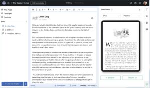
Most publishers and agents want a specific format: Times New Roman, 12-point font, double-spaced. There’s a title page with the estimated word count and your contact info at the top and the title and your pen name (even if it’s you’re real name. If it’s a pseudonym, put the pen name in quotes.) halfway down the page. If you are subbing print–rare these days, and thank God for small miracles–pagination on every page following the title page is required. If submitting electronically, don’t paginate. Use “#” for scene breaks. Dedication is optional, as are acknowledgments and about the author, but copyright is not needed, even if you registered it. That will be added on publication.
For freelance editors, it’s even easier. Word, Google Docs, OpenOffice all track word counts, so we just need the title page and your prose. However, same rules apply. Times New Roman, 12 point, and double-spaced.
“But why don’t you want page numbers?”
Well, unless I’m looking at a hard copy, which I assure you I will not until your tome is out in the wild, I can see the page numbers in the lower left-hand corner of Word.
“What if the publisher wants something different from what you described?”
That brings me to the most important thing a writer can remember about submitting any kind of manuscript: Read the bloody guidelines! This means you.
“But I want my book to look a certain way. Why can’t I format it?”
Because your book, even if all we do is move commas around and make snarky comments about something funny you wrote, your manuscript and all its carefully formatted pages are going to get altered. At this point, we, the editors, don’t care. Neither should you. One reason is all those funky things you do with formatting come when it’s time to send the book to press. The formatter does that. (I offer formatting services, by the way, just not while I’m editing the book. One step at a time, kiddo.) We are focused on the prose. How are the words strung together. Do you use the Oxford comma or are you wrong? (Another pro tip: Helpful if you tell me your stance on that before I begin reading your manuscript. The publisher will tell you whether you use the Oxford comma or not. An agent has no business having a position on that for anything but their own writing.)
Formatting, if I may beat the dead horse, is how the book will look in print. And if you even partially format a manuscript that has, at best, only a beta read or two, you’re wasting your time. Words are going to move around. Besides, the bigger the publisher, the less control you have over how the book looks, what cover you have, etc. Just because you want that chapter to end on page 34 doesn’t mean that will survive even a proofread.
Instead, focus on sharpening your prose. Read the submission guidelines. If they’re not specific, the above–Time New Roman, 12-point, double-spaced–is sufficient, along with a title page (if subbing to an agent or publisher.) That’s all you need. The formatter will take it from their when your editor is finished.